Feature 03 · Onboarding Flow
Six steps to done.
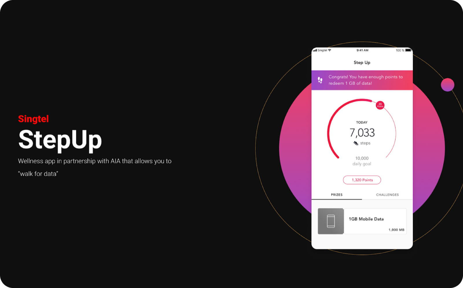
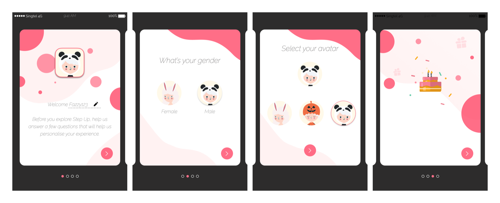
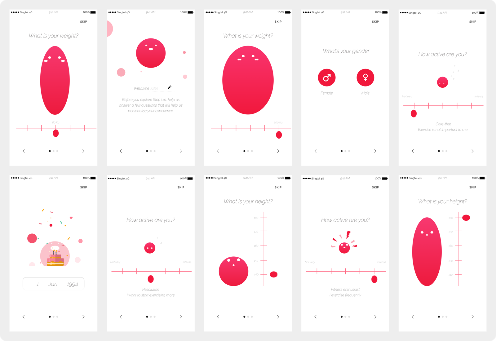
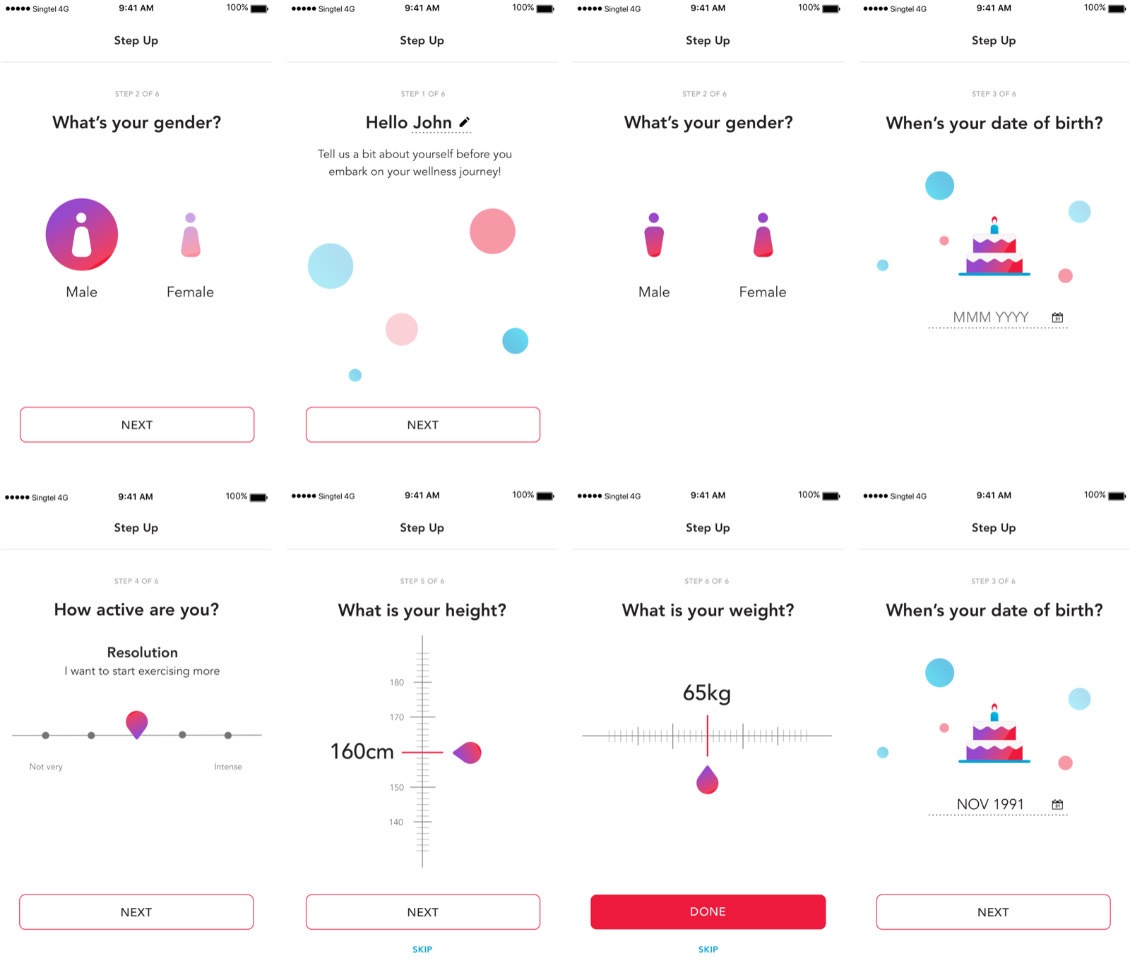
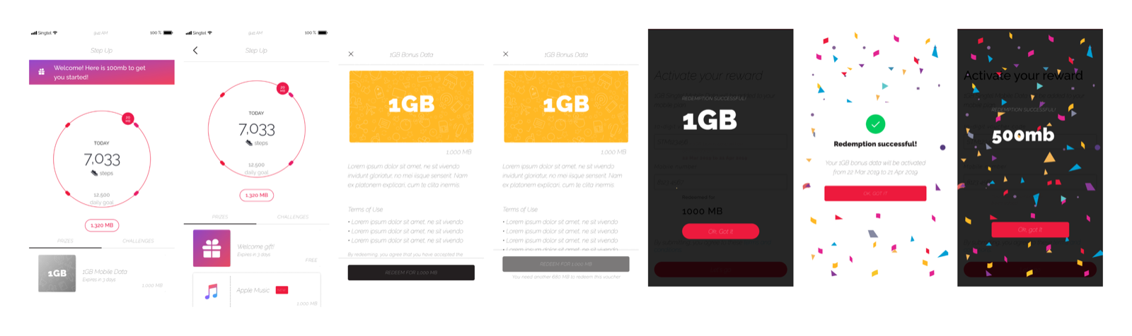
The onboarding flow consisted of six stages: entry point, registration, animated dashboard, notification, ticket feature introduction, and redemption. I suggested creating a limited-time onboarding prize of 1GB of data to motivate user sign-ups and introduce the redemption flow during onboarding. Without this, users may not know how to redeem their points until after completing milestones.
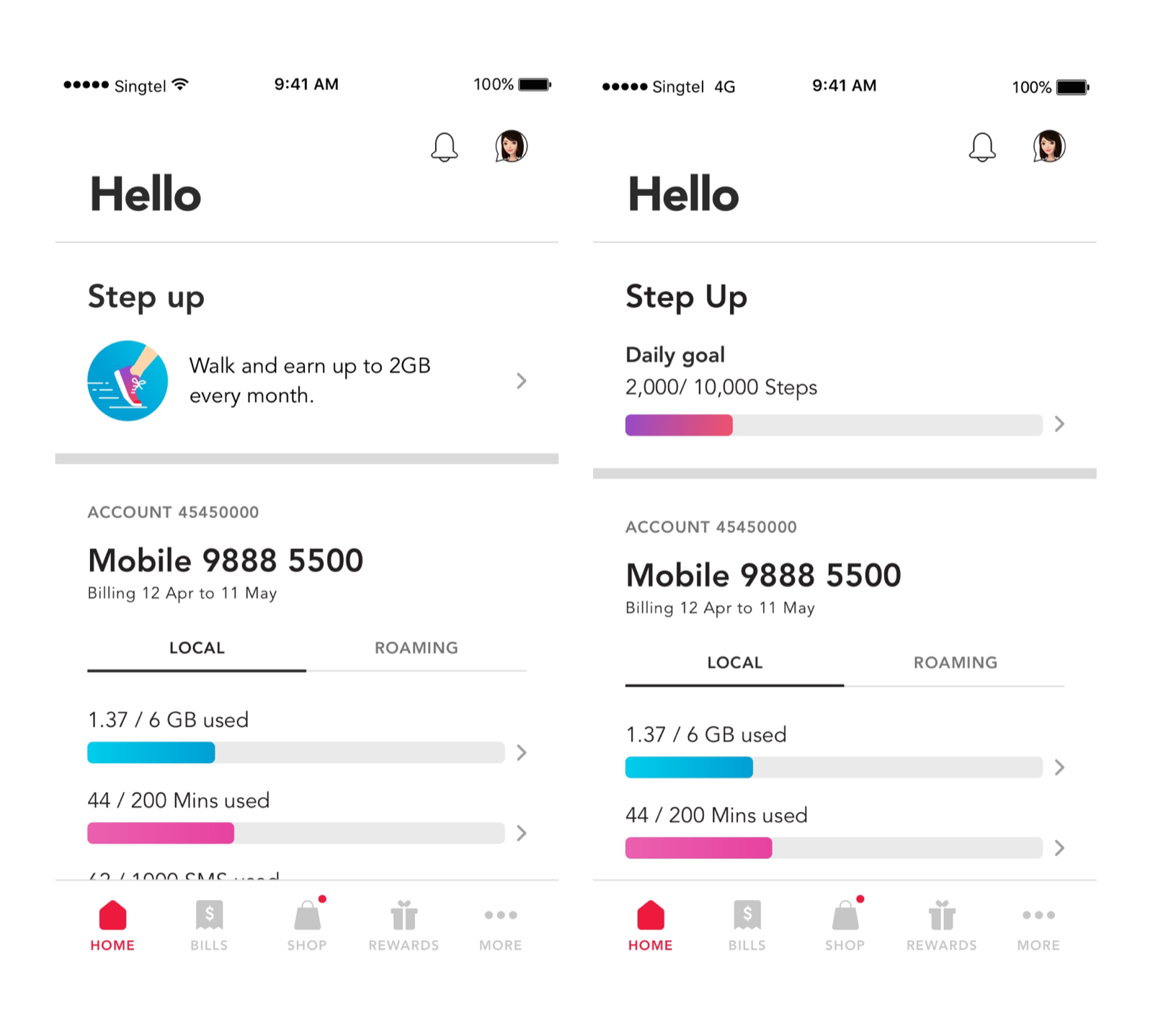
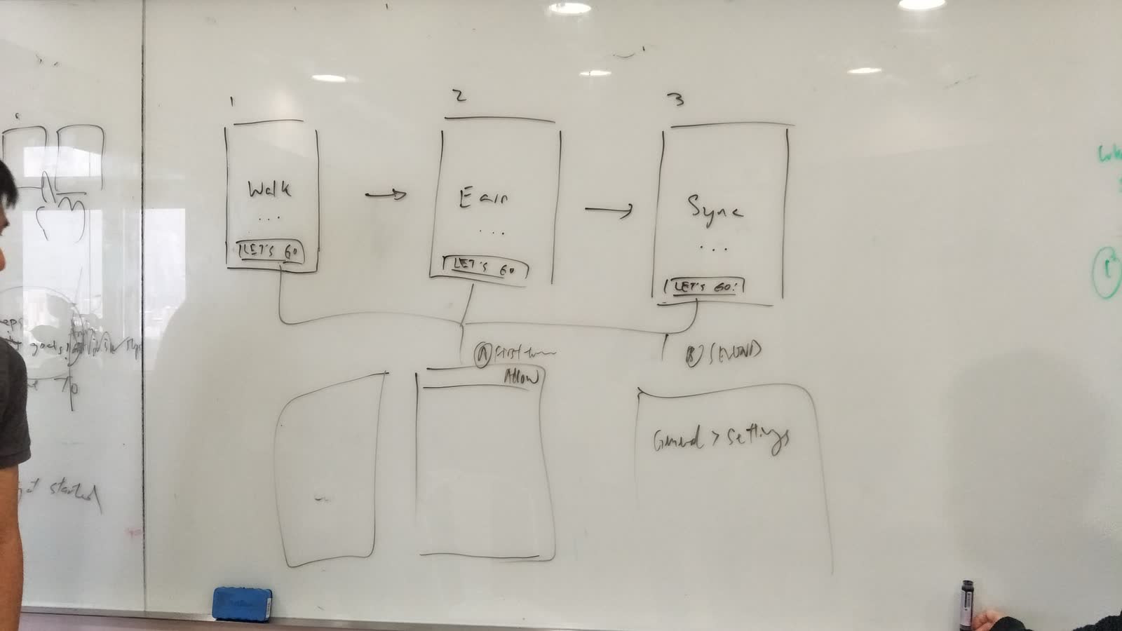
- AEntry point. Needed to draw people in and communicate our value proposition to the users. Show the benefits of taking part in this activity while fitting the visual design of the MSTA.
- BImmediate reward. Users were given a voucher upon completion of the onboarding flow, which allowed them to redeem their points. This taught them the claim flow without needing to complete milestones first.
- CAnimated dashboard. Step count and progress animated in real time, creating a positive feedback loop that kept users engaged.
- DProgressive introduction. Features introduced one at a time. No screens with five new concepts at once.
Impact 97% onboarding completion rate. Users understood the full reward system by the time they finished, because they had already used it.