Dashboard · GovTech · 2025

Product Scorecard.

Reimagining how GovTech tracks and visualises product health — from scattered spreadsheets to a single strategic dashboard that enables fast, confident decision-making.

Designer Issac Ting
Role Lead UX Designer
Client GovTech Singapore
Duration 6 months
Product Scorecard management dashboard showing product health metrics
Fig. 01 · Management Dashboard — executive overview GovTech Singapore
The Brief
01

A single source of truth.

GovTech needed a way to consolidate product health metrics from 5+ siloed systems into one strategic dashboard — replacing scattered spreadsheets and ad-hoc Confluence decks with a tool that enables fast, role-appropriate decision-making.

The design reimagines the Scorecard as a tool for strategic visibility, not just data entry.
75%
Faster reporting time
5+
Data sources consolidated
90%
User satisfaction improvement
The Problem
02

Nobody could see the whole picture.

Product data lived everywhere and nowhere. Leadership couldn't track ROI, teams used different criteria for assessment, and quarterly reviews required days of manual data collection.

How might we create a unified view of product performance that serves everyone — from PMs entering data to Senior Leaders making strategic decisions — while reducing manual effort and building trust in the data?
Pain № 01

Siloed data.

Product teams lacked visibility into cross-product performance. Metrics were scattered across different systems with no single source of truth.

Pain № 02

Manual, error-prone reporting.

Quarterly reviews required extensive manual data collection. Reports were prone to inconsistencies and errors — 75% of reporting time was wasted.

Pain № 03

Low ROI visibility.

Leadership couldn't track return on investment effectively. There was no clear way to compare product performance across the organisation.

Pain № 04

Inconsistent prioritisation.

Different teams used different criteria for product assessment. Without standardised ratings, strategic planning was driven by intuition rather than data.

The Process
03

Four phases of strategic design.

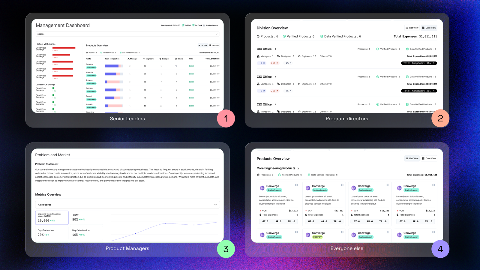
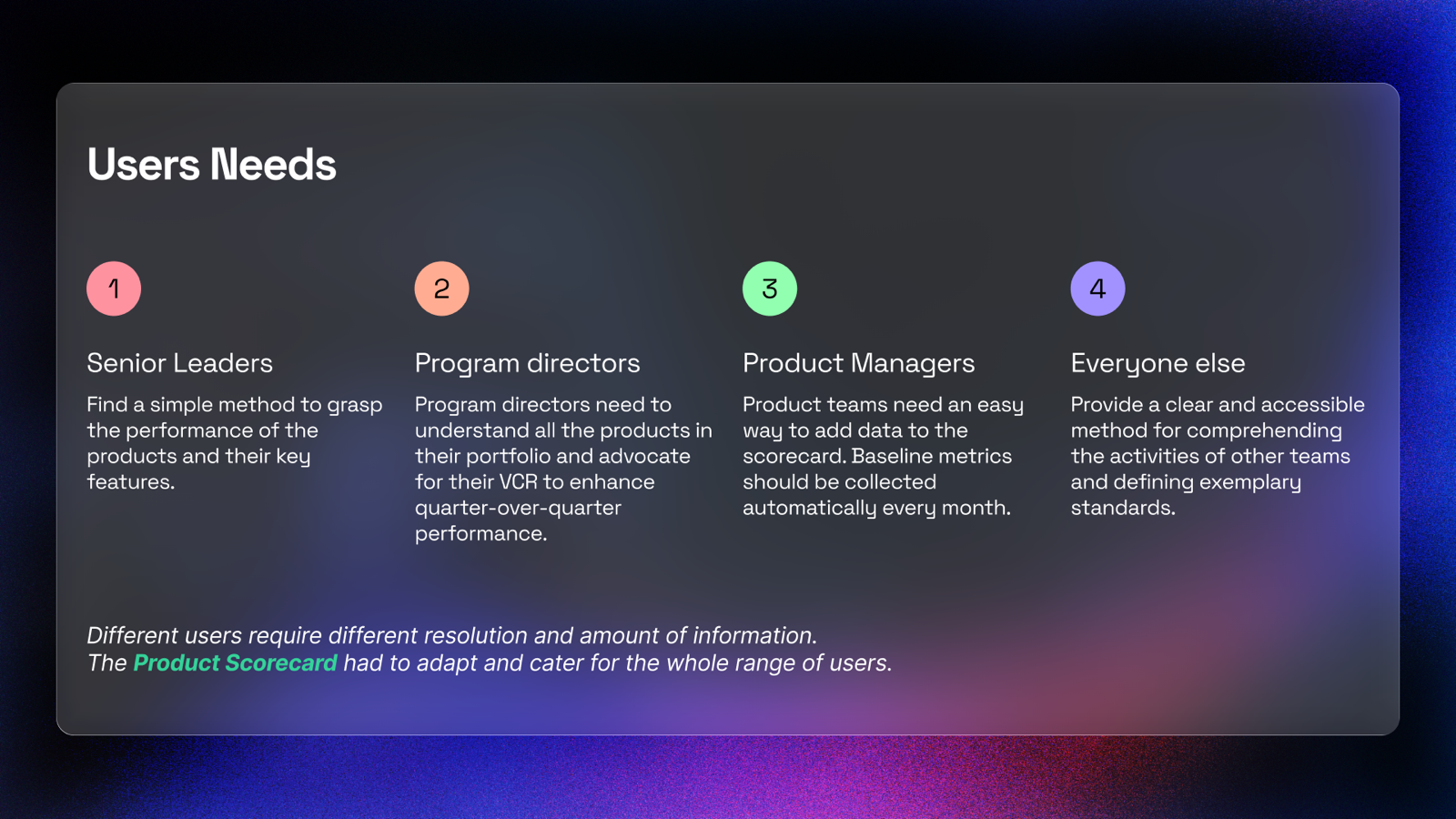
Before building dashboards, I mapped the information needs of every stakeholder — from Senior Leaders who need glanceable metrics to PMs who need guided data entry.

Step 01

Discover.

Frustration & confusion

Product teams lack visibility into cross-product performance. Metrics are scattered across spreadsheets, Confluence decks, and siloed systems.

VisibilityClarityAccess
Step 02

Align.

Confidence & understanding

Stakeholder interviews reveal that different roles need different resolutions of data. Leaders need glanceable summaries; PMs need granular input fields.

RolesHierarchyContext
Step 03

Build.

Focus & momentum

A comprehensive design system with 25+ components is created. Consistent patterns for data visualization, navigation, forms, and feedback emerge.

ComponentsPatternsSystem
Step 04

Validate.

Trust & clarity

Usability testing with real stakeholders validates the information hierarchy. Refinement cycles ensure each role gets the right level of detail.

TestingIterationTrust
From insight → principle

Four principles, one dashboard.

01
Information · Architecture

Clarity over complexity.

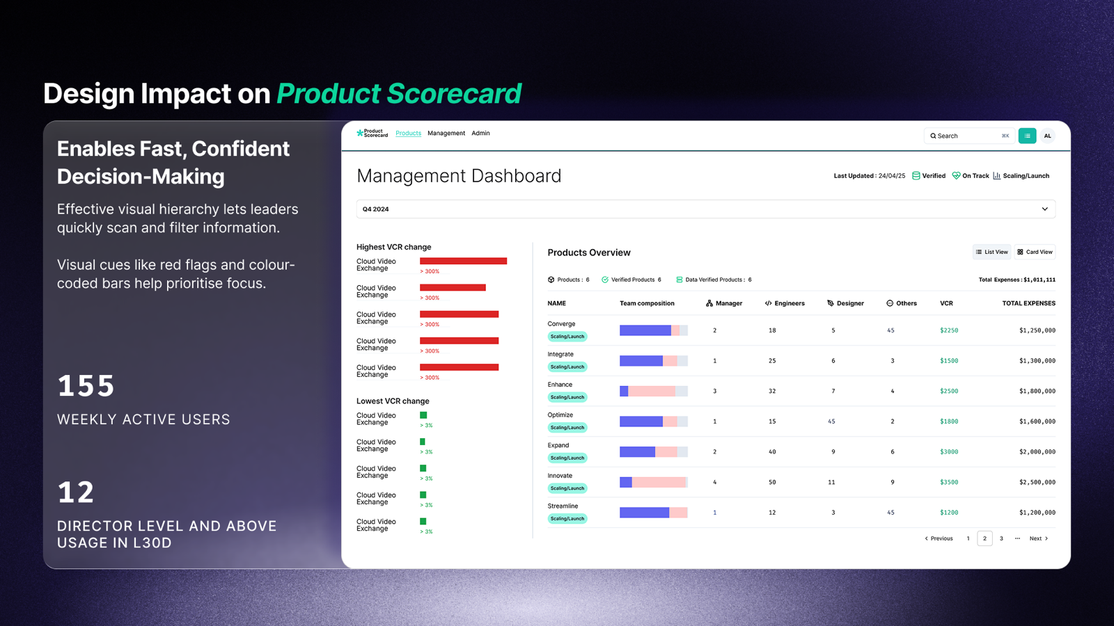
Simplified the IA so that the most critical metrics are always visible first. Progressive disclosure handles the rest — detail on demand, not detail by default.

02
Visual · Language

A consistent design language.

Created a unified visual system with 25+ components — consistent patterns for data visualisation, navigation, forms, and feedback across all views.

03
Roles · Customisation

Role-responsive UI.

Different users need different resolutions of data. The dashboard adapts — Senior Leaders see summaries, Directors see trends, PMs see input fields.

04
Workflow · Guidance

Guided progression.

Step-by-step workflows with contextual help. Onboarding reduces time-to-value for new users and increases data completeness across the platform.

The Solution
04

Four views, one platform.

Each dashboard view maps to a user role, and each role maps to a specific information need. The shape of the dashboard follows the shape of the organisation.

Focus: High-level VCR & Expenses
Total VCR
$12.2M
+14%
Total Expenses
$410K
-2%
High-level trend line
Feature 01 · Management Dashboard

Strategic visibility at a glance.

The Management Dashboard enables fast, confident decision-making through effective visual hierarchy. Leaders can quickly scan, filter, and drill into product performance across the entire portfolio.

  • AVisual hierarchy. Leaders can quickly scan and filter — red flags and colour-coded bars help prioritise focus.
  • BVCR change tracking. Visual indicators highlight highest and lowest performing products with trend lines.
  • CPortfolio overview. Comprehensive table with team composition, VCR, and expense tracking in one view.
Impact 155 weekly active users, 12 director-level users in last 30 days. Reporting time reduced by 75%.
Management Dashboard view showing product health overview
Feature 02 · Role-Based Views

The right data for the right role.

Different stakeholders require different resolutions and amounts of information. The Product Scorecard adapts its interface based on who's looking — from high-level summaries for leadership to granular input forms for PMs.

  • ASenior Leaders. Simple methods to grasp product performance and key features at a glance.
  • BProgram Directors. Comprehensive portfolio understanding and VCR advocacy tools with trend analysis.
  • CProduct Managers. Easy data entry with automatic baseline metric collection and guided onboarding.
Insight Understanding that different users require different resolutions of data drove the entire multi-view architecture.
Role-based dashboard views for different stakeholders
Feature 03 · Data Trust

Building trust in the numbers.

A dashboard is only as useful as the trust users place in its data. We introduced verification tags, data freshness indicators, and structured onboarding to ensure high-quality, trustworthy data across the platform.

  • AVerified tags. Visual cues signal data reliability, helping users evaluate which metrics are trustworthy.
  • BEnhanced onboarding. Clear placeholders and guides increase data completeness and reduce PM ramp-up time.
  • CRisk exposure. Spot underperforming products with visualised VCR trends. Reveal hidden inefficiencies early.
Impact Design shifts teams from reactive firefighting to proactive product governance. 75% fewer manual errors in reporting.
Data trust features showing verification and onboarding
— 30 —
Product Scorecard
Designed by Issac Ting
GovTech · 2025
End of case study