Gamification · Singtel · 2019

hi!Carnival.

Singtel's first gamification project. A fishing game that anyone can learn in one tap, regardless of language or gaming experience. 2.2 million sessions in 2 months.

Designer Issac Ting
Role Concept, UX, UI, Animation
Client Singtel
Duration 2 months
Team Issac Ting, Darryl (Illustration)
Loading prototype…
Fig. 01 · hi!Carnival: interactive prototype walkthrough Singtel hi! App
Open in Figma
The Brief
01

A game learned in one tap.

I conceptualised, designed, and created hi!Carnival, Singtel's first gamification project. I was one of two designers, guided by our Assistant Director to create a new way to engage users. Our goal: create a game that could be learned with a single tap, by users from diverse backgrounds, many of whom had never played mobile games before.

Our goal was to create a game that could be learnt with one tap, for users who might be unfamiliar with mobile games, from diverse backgrounds and with limited language capabilities.
2.2M
Sessions played in 2 months
+20%
Monthly active users
100%
Onboarding success rate
CEO
Singtel Award for Innovation
The Problem
02

Games assume you already know how to play.

Most mobile games assume baseline gaming literacy. Our users, primarily Singtel pre-paid customers including migrant workers, had diverse backgrounds, limited language capabilities, and often no gaming experience at all.

How might we create an engaging game that can be understood and played by users who are unfamiliar with mobile games, across language barriers, cultural differences, and varying levels of digital literacy?
Pain № 01
critical

Language barriers.

Majority of pre-paid users were migrant workers with limited language capabilities. The game couldn't rely on text-based instructions or tutorials.

Impact accessibility
HMW

How might we communicate game mechanics without any text or language dependency?

Pain № 02
critical

No gaming literacy.

Many users had never played mobile games. Complex mechanics, multi-step tutorials, and abstract concepts were out of the question.

Impact usability
HMW

How might we teach game mechanics to someone who has never played a mobile game?

Pain № 03
high

Diverse backgrounds.

Users from different cultural and educational backgrounds needed to understand the same game without localisation or cultural adaptation.

Impact reach
HMW

How might we design a universal game metaphor that transcends cultural context?

Pain № 04
high

Retention challenge.

The game needed to bring users back to the app every day. A single play session wasn't enough. The loop had to be compelling and self-sustaining.

Impact engagement
HMW

How might we create a daily return loop using only visual cues and simple rewards?

Feature 01 · The Fishing Game

Tap. Catch. Repeat.

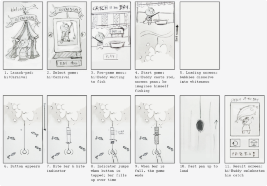
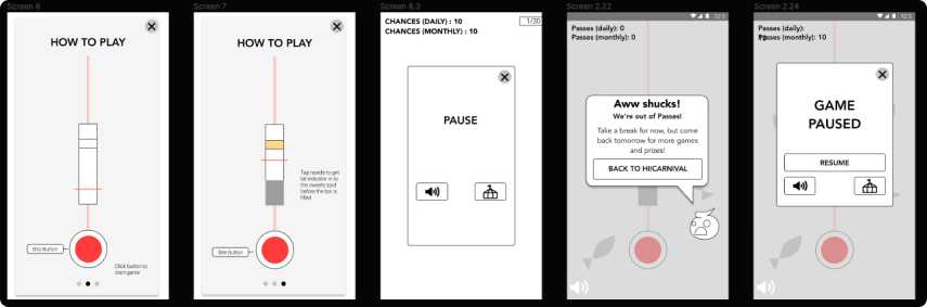
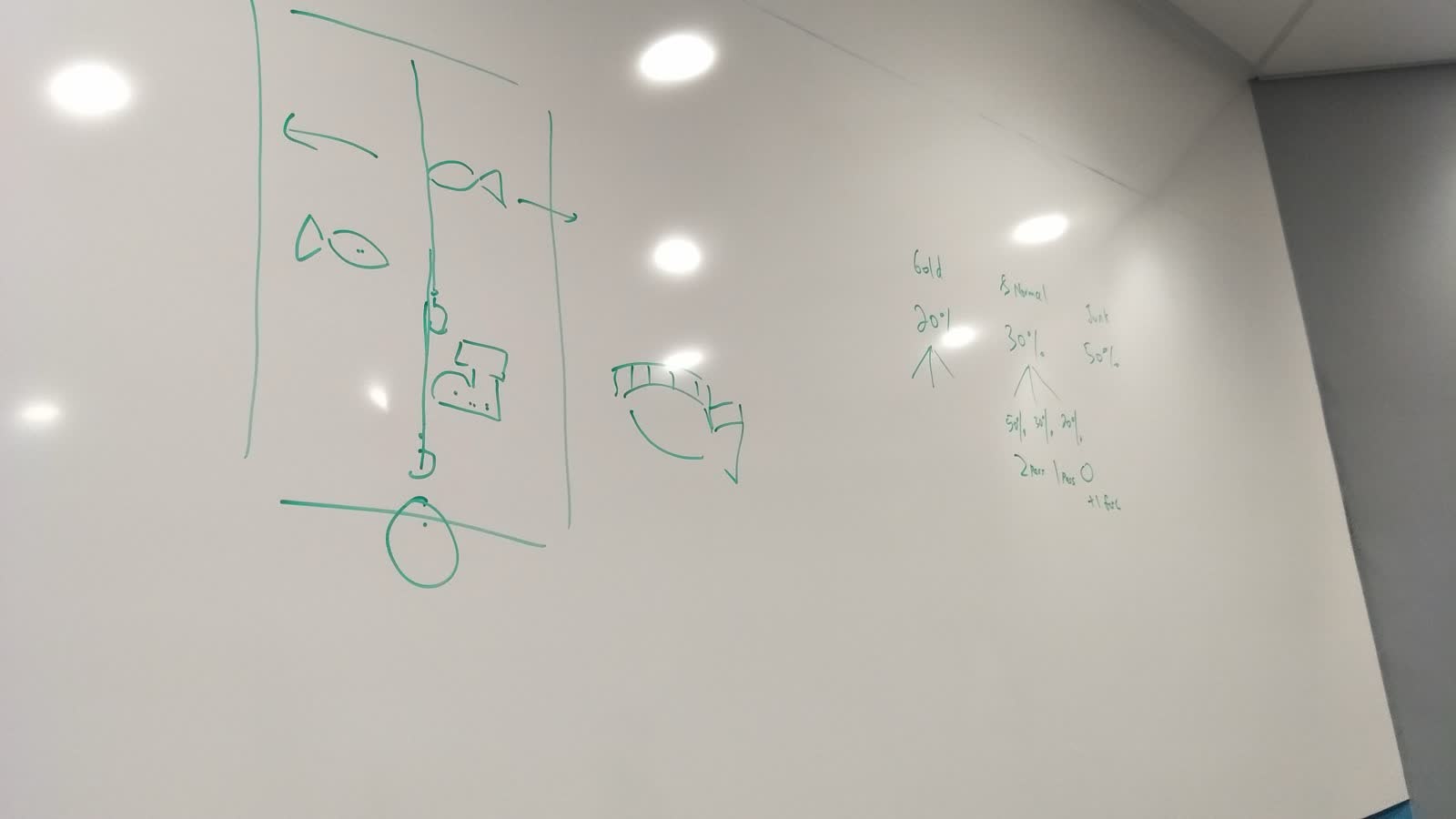
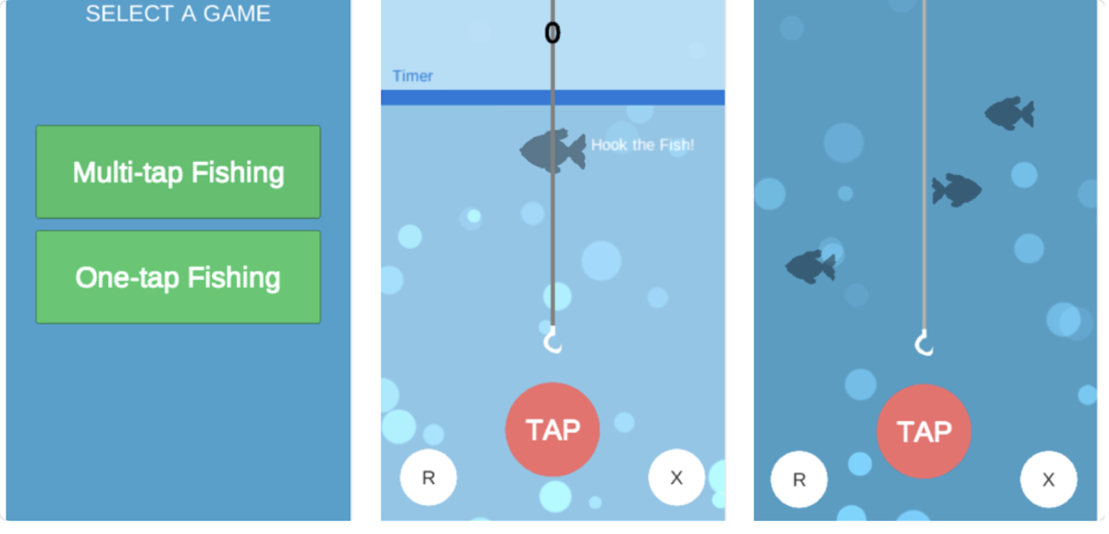
Our initial concept was a game where a red line would move along a white strip and users had to tap a button when the line landed on a yellow strip. We did a quick prototype in Unity to test it and realised that only half our users understood how to play. Going back to the drawing board, we changed the core mechanics to reflect the action of "fishing." By tapping the button, the hook would move up and when it collides with a fish, the fish gets caught.

  • AOne-tap mechanic. A single button maps to a single action: up. No combos, no timing bars, no abstract symbols.
  • BUniversal metaphor. The fishing action was very easily understood by our users when we play tested it. We were able to teach all our users within one try.
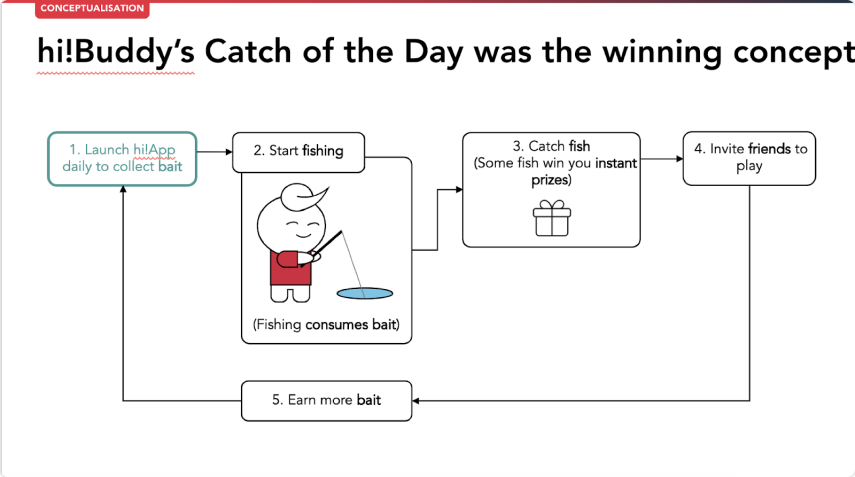
  • CDaily core loop. Users come in every day to receive "bait" which allows them to play the game. These are limited chances that get refilled daily or rewarded when players catch certain fishes.
  • DProgressive mechanics. Tickets, leaderboards, and special event fishes are introduced one at a time after the core loop is mastered.
Impact 100% of playtest users learned the game within one try. The fishing metaphor solved what abstract mechanics couldn't.
hi!Carnival main game interface with fishing hook and fish
Fig. 05 · Main game interface
Feature 02 · Interactive Onboarding

Learning through play.

Our onboarding experience was done through interaction as opposed to using text to explain. We designed it by introducing a "learning through play" concept used in game design. This helped to reduce the work needed for translating the game.

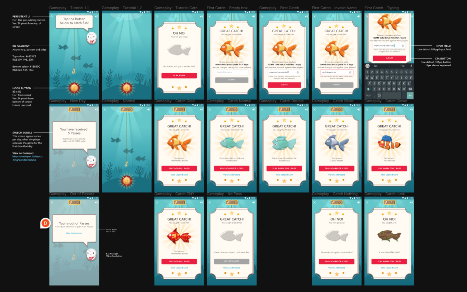
  • ASafe room. We designed what is called a "safe room" where users can experience the mechanics without being punished on their first play through. Users are shown the button and when they click it, the hook moves up. If users fail to catch a fish, they are given infinite tries until they catch their first fish.
  • BUsername and leaderboard. Once they caught their first fish, we then ask for their username, which is used to display their score on the leaderboard.
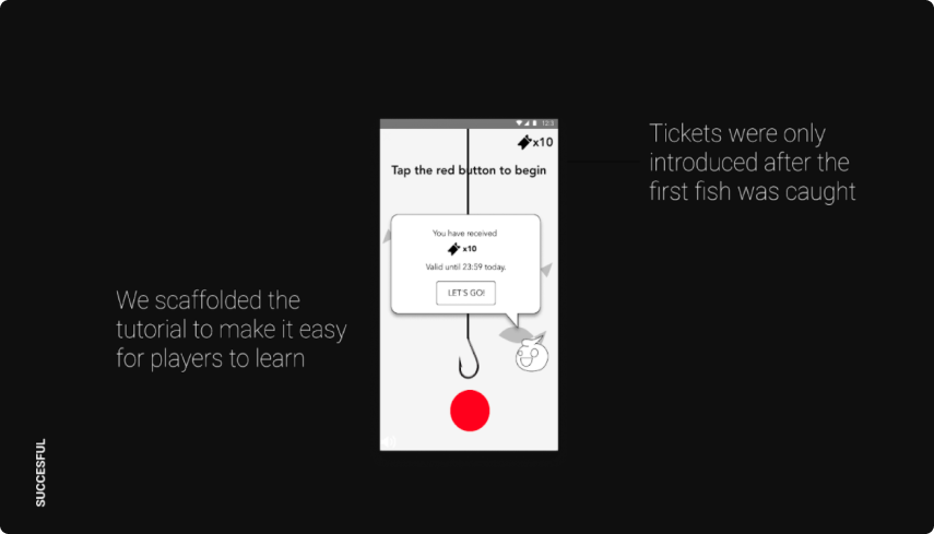
  • CIntroducing tickets. Once users finish their first loop, we introduce them to the concept of "tickets" and inform them that this will be replenished every day. By breaking up the different mechanics, we were able to onboard users who have never played any games before very easily.
  • DNo words needed. We did not use any words for "tickets" but instead used an icon to represent it so that we don't have to translate it. Once the concept of "tickets" was introduced, the user has officially learned the game.
Impact 100% onboarding success rate. The "learning through play" approach eliminated the need for text-based tutorials entirely, making the game accessible across all language backgrounds.
Safe room design, infinite tries until first catch
Fig. 06 · Safe room: infinite tries until the mechanic clicks
Feature 03 · Entry Point & Retention

A reason to come back.

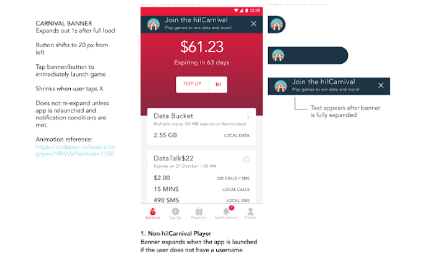
The game was built in an in-app browser and part of the design was to determine the best entry point. We created a banner that would show users information on what the game was about on their first view and then later shrink it in further sessions.

  • AProgressive banner. Full information for first-time users, compact for returning users. Built within Singtel's in-app browser.
  • BDaily bait refill. Limited chances replenished daily, creating scarcity and a reason to return. Catching certain fishes rewards extra bait.
  • CCore loop. Receive bait, play, earn tickets, redeem rewards. A self-sustaining engagement cycle designed so users come back to the app every day.
Impact The daily return loop drove 2.2 million sessions in 2 months. Users came back not because they were told to, but because the loop was rewarding.
Entry point banner for new users
Fig. 07 · Entry banner: full information for new users
Core game loop diagram showing daily bait cycle
Fig. 08 · Core loop: bait, play, tickets, rewards
Feature 04 · Visual & Animation

From app to underwater.

Upon clicking into the entry point, an animated transition was created to bring the user from the app to the game. This animation was done by me in CSS. I also designed and illustrated all the interface and background in the game while my partner Darryl designed the fishes and the hi!Buddy illustrations.

  • ALoading transitions. An animated CSS transition brings users from the app's entry point into the underwater game world. Built lightweight, runs everywhere.
  • BFull art direction. Interface, backgrounds, character states, all designed and shipped within the 2-month timeline.
  • CSeasonal updates. The game continues to be updated for special events: Christmas, Valentine's Day, and cultural celebrations. An "ang bao" fish was added for Chinese New Year.
Reflection This was my first project in the working world. I was glad I could use my wide range of skills: animating, coding, designing, and even writing the music.
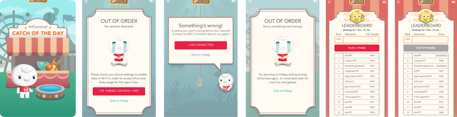
Visual development process, interface elements and backgrounds
Fig. 09 · Visual development: interface, backgrounds, transitions
Final game visuals with hi!Buddy character illustrations by Darryl
Fig. 10 · Final visuals: hi!Buddy illustrations by Darryl
The Process
04

From failure to fishing.

Our first prototype failed. Half the users couldn't understand it. The breakthrough came when we replaced abstract mechanics with a universal metaphor: fishing.

The pivot

From abstract to universal.

Initial red-line game concept, only 50% of users understood how to play
Fig. 02 · Initial concept: red line on white strip. Only 50% of users understood the mechanic.
Fishing game mechanics, 100% of users understood on first try
Fig. 03 · Fishing metaphor: hook, fish, one button. 100% comprehension on first try.
User testing results confirming 100% comprehension with fishing mechanics
Fig. 04 · Testing confirmed universal understanding. The fishing metaphor worked across every user group.
From mechanics → experience

Three design strategies.

01
Onboarding · Learning through play

Teach without words.

Interactive onboarding instead of text tutorials. A 'safe room' gives infinite tries on the first play. No punishment, just discovery. No translation needed.

02
Retention · Daily loop

A reason to come back.

Daily 'bait' refills create a natural return loop. Catching special fish rewards extra tries. The core loop: receive bait, play, earn tickets. It sustains engagement.

03
Craft · Visual storytelling

Bridge the gap with story.

CSS transitions bring users from the app to an underwater fantasy. hi!Buddy performs a fishing action that bridges the narrative gap. Every visual tells the story.

The Impact
05

What changed.

2.2M
Sessions played within 2 months
+20%
Monthly active users
100%
Onboarding success rate on first try
CEO
Singtel CEO Award for Innovation and Engagement

Within 2 months of launch, hi!Carnival had driven 2.2 million game sessions and increased monthly active users by 20%. The project was awarded the Singtel CEO Award for Innovation and Engagement.

The fishing metaphor and "learning through play" onboarding meant every user we tested could learn the game within one try. No text, no tutorials, no translation needed.

Reflection · First Project

A wide range of skills.

This was my first project in the working world. I was glad I could use my wide range of skills: animating, coding, designing, and even writing the music. The 2-month timeline forced sharp prioritisation and close collaboration.
  • AConcept to ship in 2 months. From the initial Unity prototype through the fishing pivot, visual development, CSS animation, and final launch.
  • BOne of two designers. I was one out of two designers on this project. I handled interface, backgrounds, CSS transitions, and music. My partner Darryl designed the fishes and the hi!Buddy illustrations.
  • CStill running. hi!Carnival is still part of the Singtel hi! app, updated seasonally for special events and cultural celebrations.
Impact Awarded the Singtel CEO Award for Innovation and Engagement. The game continues to drive engagement across Singtel's pre-paid user base.
— 30 —
hi!Carnival
Designed by Issac Ting & Darryl
Singtel · 2019
hi!Carnival is still part of the Singtel hi! app, updated seasonally for special events.
End of case study