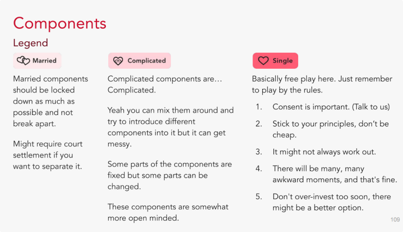
Pain № 01
No standardisation.
Designers built components purely based on their use case. No usage guides, no rules on when and how components should be used, no enforced best practices.
Democratising design capabilities across Singtel. From the 'three button problem' to a system of shared components, interaction guidelines, and a language the whole team speaks.
In my first month at Singtel, I was asked to 'align which button we should use.' Three buttons existed: legacy, current, and proposed. Nobody could agree. It would take a year and a Design Language System to understand why.
The design team built projects in isolation. No usage guides, no visibility into what others had built, no shared naming conventions. Developers faced the same problem: variants of the same component existed without anyone knowing.
I became aware of it in my first month at Singtel when I was given the task to "align which button we should use" by my boss. Me, being overly optimistic and significantly naive, believed that all I needed was to have the designers sit down and talk.
Needless to say this did not go as planned.
We were presented with three buttons: one used in the legacy designs, one used in the current designs, and one that was being proposed as the new designs. It was only until a year later when my new Director came in and led us on the creation of our Design Language System, Ember, that I understood what it was that we were struggling with.
Designers built components purely based on their use case. No usage guides, no rules on when and how components should be used, no enforced best practices.
Designers didn't know when others had already built a component. Developers faced the same problem: variants of the same component existed in parallel.
Naming conventions differed across designers and developers. The same component had different names depending on who built it and when.
Developers built code based on existing designs with no say in how components should function. They wanted agency in the system too.
We started with adoption, moved to communication, and ended with quality. Each phase taught us something about what it takes to build a design system that people actually use.
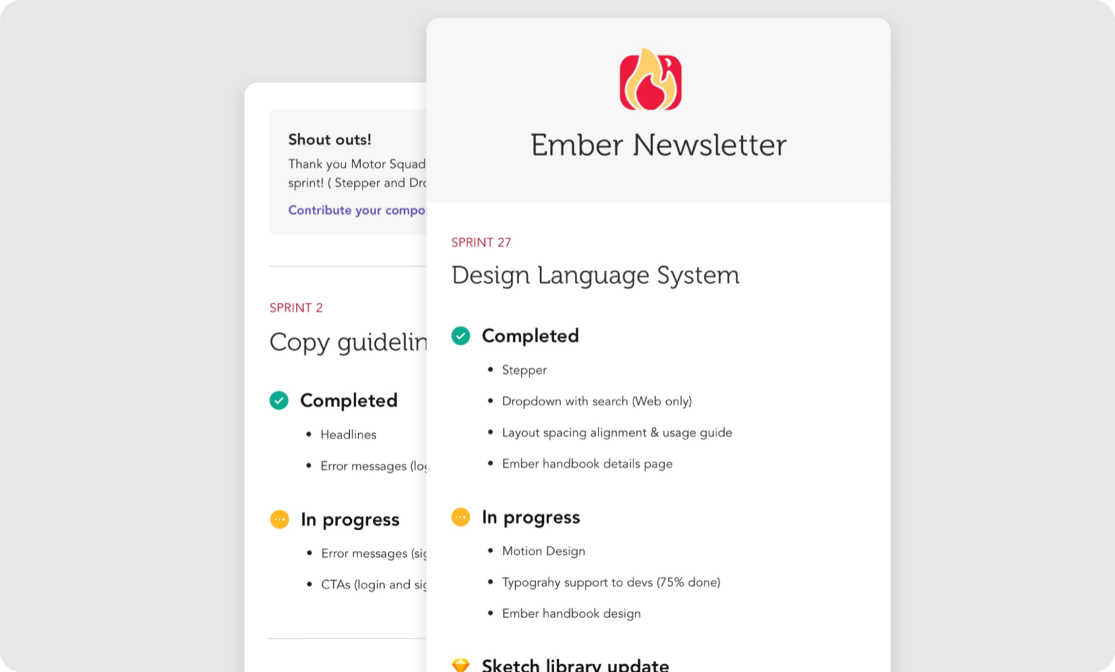
Usage guide with aligned naming, visual specs, status indicators, and usage rules. Component library for both App and Web, distributing easy-to-use patterns with new releases each sprint. We started with a 3-day workshop with designers and developers. Through the inception, we were able to learn about what their needs were.
WIP boards for async collaboration, sprint newsletters for visibility, and copy guidelines co-created with the Copy Chapter. We introduced a RACI model (Responsible, Accountable, Consulted, Informed) to clarify decision-making. It helped us focus on the needs of those whose projects were more urgent. But it also left some designers feeling like we were being uncollaborative, something we discovered from our 90-day retrospective.
We wanted to move away from focusing on aligning the team and still be able to push our design capabilities. We split our design efforts: I focused more on pushing the quality of interaction while my co-workers focused on managing alignment, refining components, and updating usage. Animated splash screens, interaction guidelines categorised into 5 groups, card transitions, and motion design pushed Ember from functional to premium.
A lot of times we would face a lot of push back early on. Designers, even though they were on the same team, were highly opinionated (as they should be because they take pride in their job.) This did make it difficult to get buy-in from everyone as sometimes they would disagree with the choices we would make. Once, I spent 2 sprints trying to align the colour of a grey divider among 5 designers. It is not an experience I'd recommend.
The RACI model helped us illustrate the required action from each person and by doing so, empowered us to make the decisions in order to move our project forward. This worked for a little while but it also left some designers feeling like we were being uncollaborative.
As part of our design team's practice, we would have a massive retrospective every 90 days to understand everything that the team is going through. All 30 of us from the Design Experience team would share our thoughts. One feedback we got for the DLS team was that the team wanted more collaboration. At that point all the components were decided and made by the Design Team and we ended up gatekeeping and holding back some designers who wanted more creative freedom.
As an interactive designer, I defined the micro-interactions and motions incorporated into every component. Experimentation in After Effects and CodePen produced high-level prototypes that were refined to fit our design principles.
The most challenging piece: an animated splash screen that communicates Singtel's brand when users open the app. "Hello", the universal phone greeting, bridges connection. Singtel's dot motif draws greetings in different languages, celebrating community.
Ember wasn't just components. It was newsletters, WIP boards, RACI charts, and sprint showcases. The 90-day retrospective taught us that a design system lives or dies by how open it is to feedback.
The video trailer was made at our 1-year mark to introduce Ember to the development team, which consisted of a department of over 80 engineers. It was very well received and we managed to get more developers to help contribute to the Design Language System.